Project Description
Blark identity
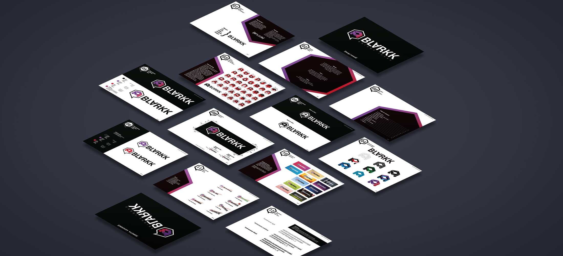
Logo concept for the agency Blarkk. The word ”blark” is, beside of being af subtraction of the team members first letters, also a subtraction of the words ”Black” and ”Dark”. The agency wants to reflect the opposite; Fresh and colorful. This idea is incorporated in the visual identity.
In terms of comic books, ”Blark!” is used as an expression instead of ”#%?!”, which can be used in a playful way.


